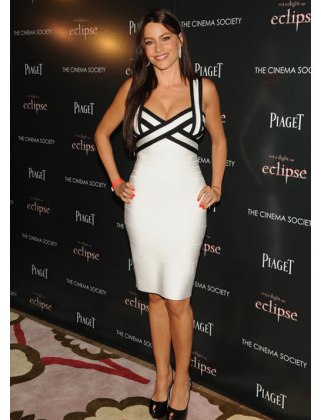
It’s a picture day. I’m working on a Campbell & Kate blog post about wearing one of my classic white shirts with the black and white trend and came across this image of Sofia Vergara wearing her own version of the graphic trend.
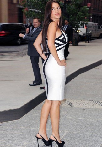
Both the dress and Sofia look amazing. Personally, I’d want a little more boob-coverage before I would ever wear this out of the house, but I’m not sure the design would look as sleek with more fabric on top. Here’s the paradox: even though it looks like the bodice can barely contain her large breasts, her breasts look smaller than they would with more fabric over them!
Surprisingly, she doesn’t have the smashed-in look from the side that I expected. Do you agree? I also wonder if she even needs a bra with this dress–it probably acts as its own bra! In fact, it’s practically a three-part cup! I love the strap going down the center.
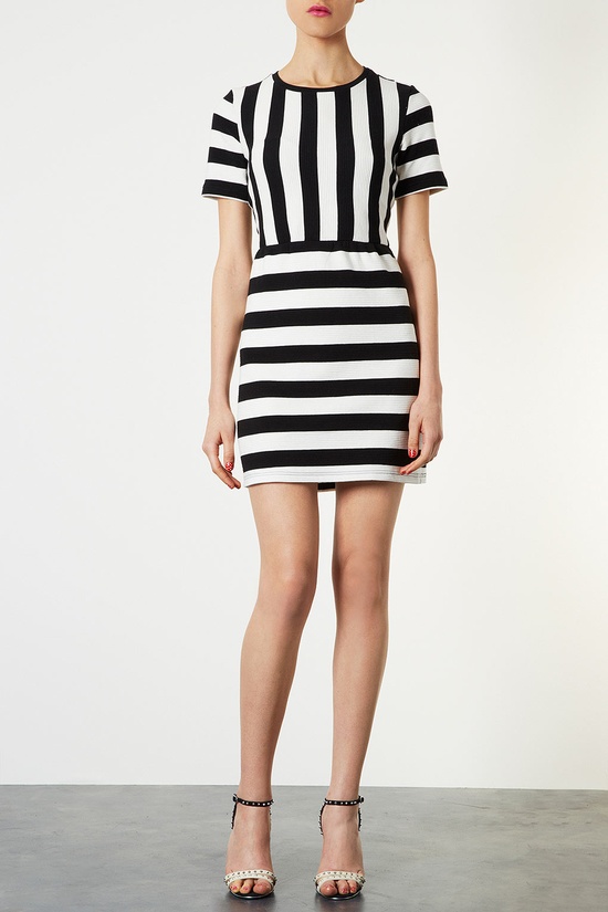
Finally, I’d be curious to see this TopShop dress on a full-busted woman. On the model the vertical stripes are already beginning to pull outwards. Would they look like bent iron bars on a G cup? Just curious.
Conclusion: When trying the graphic trend, full-busted women need to be aware of the effect of patterns around the bust. I’m sure that’s something you’ve already known forever, but these photos are a good reminder.


It makes me want to experiment. I’m always curious to try stuff on in stores before I make them, especially with trends.
It makes me want to experiment, too! I’d love to have a fit model and pattern maker and try all sorts of options to come up with something that covers more AND looks great.
Hmm. Not sure my comment made sense, but what I meant was, I’d love to have all the time I needed with a fit model and pattern maker to come up with different samples until we created something amazing for women who don’t want to reveal as much cleavage as Sofia does here.
Yeah, it’s all about needing the time to drape and play, right? I swear the part of sewing that takes the longest is the planning. I’m doing another refashion for a larger bust for another site and it’s just night and day difference but getting there takes more planning and standing back and pinning and playing. Stitching it doesn’t take that much time.
I really like Sophia’s dress. I wonder if they could just increase the width of each individual band for the large cup sizes?
In general, I really love the monochrome look and I wish there were more options out there. It seems with a large bust they could adjust the stripes (or maybe have a solid top with stripes on the waist down and arms?).
What about adding more strips of the black and white bands instead of adding width? Do you think that would keep the bust from overwhelming? Not that I mind my bust overwhelming me. I mean, that’s what they do. hehe
I really like Sophia’s dress as well. I don’t think the 2nd dress would work with the high neckline
You are so right, Donna!
I think that there is two cases when graphic print looks good on larger chest:
1) the print was created with 3D effect in mind (like Sophia’s dress);
2) fit is not snug and print isn’t something very regular, which will be very obviously distorted (like vertical stripes e.g.) This print would work just fine http://0.tqn.com/d/petite/1/0/8/9/-/-/nordstromdotdress.jpg
Those are two great principles, Malica. Interestingly, the Nordstrom dress you link to has circles in it, which I think my hero image consultant Carla Mathis would think are a good complement to curvy figures.
She is right, the print should be in harmony with body lines, but facial features are also important there, so if body is curvy and facial features are sharp then optimum is some combination of rounded and linear.