Disclosure: Some of the links below are affiliate links, meaning we may earn a commission if you click through and make a purchase, at no additional cost to you.
A few months ago, my cousin’s wife sent me a whole pile of vintage patterns from the 1950s through 1970s. I recently tried my hand at one of them, and it came out really great. I had to do a lot of work on this one, so I hope some of the tips in here are useful.
The pattern I chose, Advance Pattern #6297, has a fitted blouse with a wide-set neckline and a semi-gathered, very full skirt.
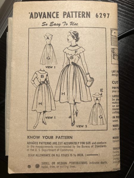
The nice thing about Advance brand patterns is that they are pre-cut to a single size. I love that you don’t have to cut them out yourself, which I consider the most tedious step in the sewing process.
While all the patterns my cousin-in-law sent me are complete and don’t even appear to have ever been unfolded, most of them are missing the envelope that would have featured color illustrations of the garments on the front and measurement and fabric guidelines on the back. So I had no way to know what size the pattern is or how much fabric to buy!
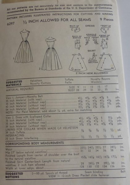
What to do? Go to Etsy! I searched for the pattern and found three people selling it, two of whom included photos of the back. (Here are links to the listings in case you want to try this pattern yourself: VintagePatternDrawer, punksrus, and StudioMariLaura.)
Next, I made a muslin of the bodice and measured the waist to see what size it corresponded to:
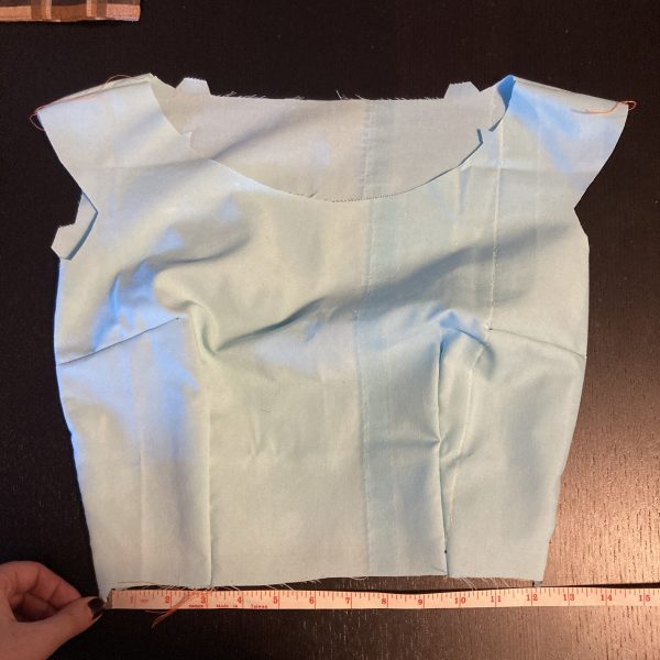
The waist was 25.5” total, which matches up exactly with size 13. To reach my 38” bust and 29.5” waist, I would need to go up about 3-4 sizes, or 7 inches at the bust. As usual, I expected grading up evenly would end up too big in the waist, but you’re always supposed to grade up to the size that corresponds to your largest measurement and then alter the other parts down (“grading” means changing the entire size of the pattern, while “altering” means tailoring only some parts of it to fit your figure better, such as a smaller waist or longer torso).
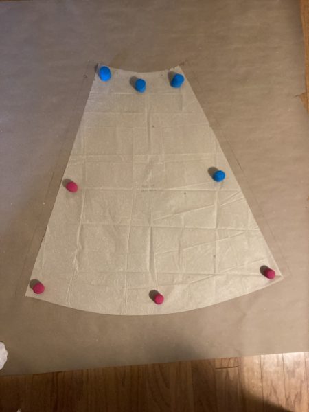
I bought a 4-foot-wide roll of brown paper from Amazon (absolutely essential for a project like this!) and traced the pattern pieces onto it. Then, as with my last vintage pattern grading project, I cut and spread the pattern pieces appropriately.
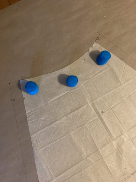
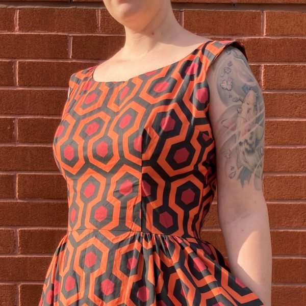
Next, I sewed up a muslin based on the new pattern pieces and assessed what needed further alteration. There was a lot to be done! I needed to bring the center bust darts about an inch higher and angle then inward a bit, lengthen the bodice, narrow the shoulders, and open the armholes more. I also changed the shape of the front bust darts to contour under my boobs better (the same way I did for my very first vintage pattern project).
It took two or three more muslins before I was finally satisfied. One thing I also realized is that when I expand the circumference of a bodice through the grading process, the bottom of the front bust dart should remain the same width. If you simply extend the lines down, then the ends will be farther apart. This made the bodice kinda wonky because it narrowed the waist in such a way that it interfered with the overall fit. But once I set the dart base back to its original width, it worked much better.
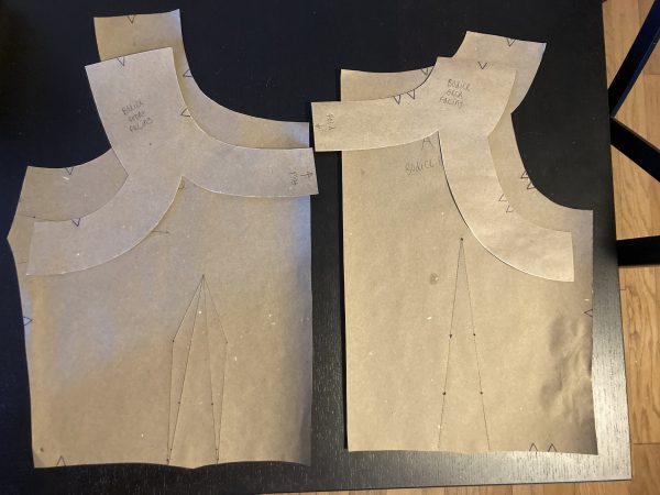
Finally, I traced the end product onto a fresh piece of paper and cut it out. As well, I traced the outline of the bodice shoulders to create facing. Here are the final pattern pieces:
The skirt pieces were much easier. I simply extended the sides evenly such that the circumference would be increased by 7 inches total. The nice thing about this skirt is that it’s partially gathered, so you can fudge the skirt waist and then gather it more or less to get it to line up with the bodice. I also cut out GIGANTIC pockets for each side of the skirt (which meant one would have to align with the zipper, a tricky prospect that I’m getting better and better at with each project).
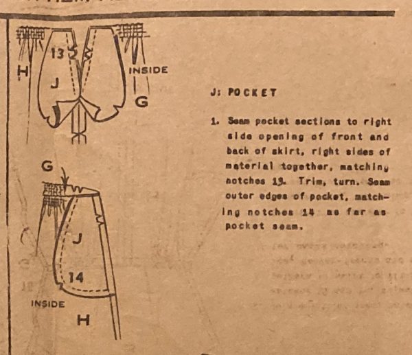
Speaking of pockets, I’m not sure if I have just been reading the instructions wrong all this time, or if this pattern has a unique way of doing it, but they were so much easier to insert with these directions. Previously, I’ve always sewn each side of the pocket together, then inserted it into the skirt. But here, it says to sew each side of the pocket to each side of the skirt, then sew each pocket half together. Note that I did not sew the top edge of the pocket to the waistband, since that holds the skirt in place close to the body instead of allowing it to spread freely with a big petticoat or a gust of wind.
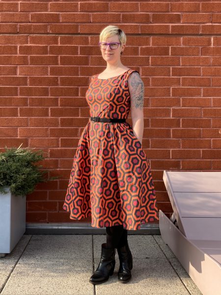
So here is the finished product:
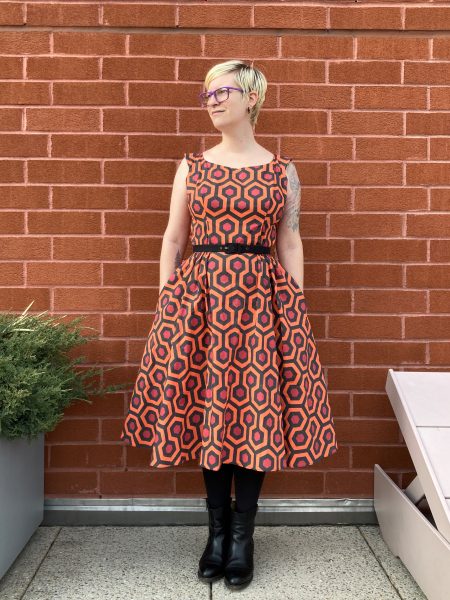
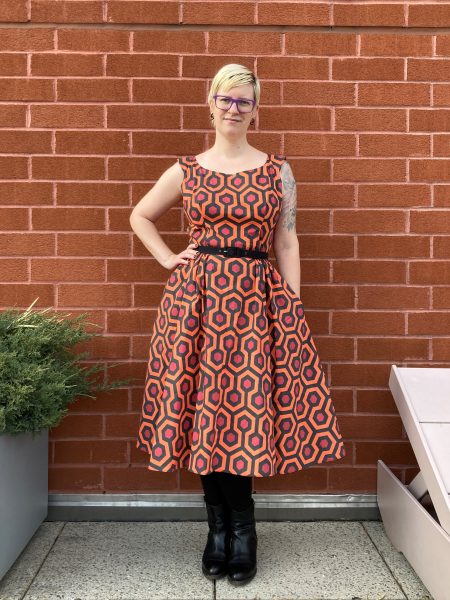
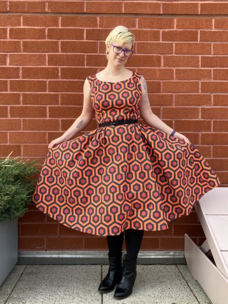
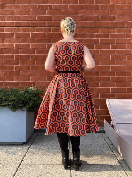
The front and back of the skirt are each made of two panels with a seam up the center (which made pattern matching a bit difficult with this print!). Then in the center of each panel, there are several inches of gathering. But the sides and the center of the skirt remain smooth. The result is lots of volume without as much bulk as if the whole thing were gathered evenly. I think it’s slightly more flattering and more interesting than a conventional gathered skirt.
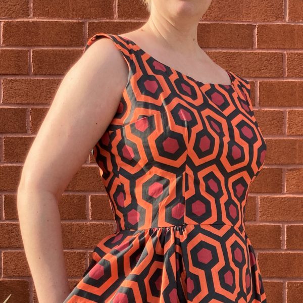
As usual for me, the waist turned out a wee bit loose (I could have made it about an inch smaller), but this is remedied with a belt, and the excess fabric is easy to hide in the gathered skirt sections when the belt is really cinched tight.
The armpits are also a little loose/wide, so I might play around with that spot next time to contour it a little better. I’m also wearing an unlined bra in these photos, but I was wearing a lightly padded pushup style (an Ewa Michalak PL bra) when I was working on the dress, so it would definitely be filled out better with a thicker bra.
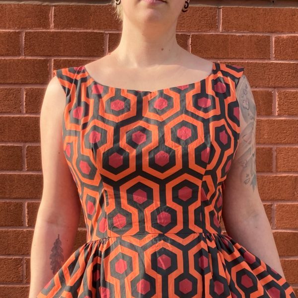
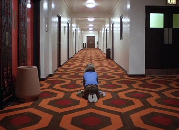
By the way, some of you may recognize this fabric as the carpet from the Overlook Hotel in the movie adaptation of The Shining. I found this fabric on Spoonflower, a website where people can upload their own designs and shoppers can purchase different types of material (and some paper goods and home décor supplies too), printed to order. I selected the “Petal Signature Cotton.” I’ve ordered the more expensive cotton sateen before, and I can’t really tell the difference. To be honest, whatever ink Spoonflower uses makes both these fabrics very stiff and a little crunchy. It also holds wrinkles pretty badly. So it’s not my favorite, but it’s worth it when there’s a print you just can’t live without.
Amazing! This looks so good on you. I love it. I’m so impressed with your skill and craftsmanship.